Featured

Blog 1: North Korea

This is the post excerpt.

The New York Times wrote an article on North Korea’s recent claim that they have tested a hydrogen bomb meant for missiles. The article, ‘North Korea Says It Tested a Hydrogen Bomb Meant for Missiles’, does a great job of incorporating photos, text, graphics and a video story in order to deliver an informative, thorough article.

The article begins with a photo that was released by North Korea and features the country’s leader, Kim Jong-un, inspecting what they claim is a hydrogen bomb that they would use to fit into a missile.  This picture grabs the reader’s attention and brings in the focus of the article. As the article continues, it further explains how serious it is to investigate if they actually tested a hydrogen bomb. It also introduces a graphic to illustrate why scientists are skeptical of their claim. By incorporating a visual graphic, it allows reader’s to understand a complex topic in a simpler way. It takes readers through the stages of creating a hydrogen bomb. I think the fact that this graphic is incorporated in the beginning of the article is effective.

In the middle of the article an audio story is presented. This video helps people understand the phases of a missile launch and the difficulty in intercepting a missile. I think that this video is used well and encourages readers to get more engaged with the article. Another effective aspect of the article features a link to a graphic that explains if North Korea could actually have the potential to hit the United States with a missile. In addition to the pictures, video and text this graphic brings everything full circle and continues to not only inform readers, but keep them engaged.

The most effective part of the blog would be the video. I think that placing the video in the middle of the article was smart and continues to make readers want to keep reading and learn more. Although I found the link to graphics on if they could actually hit us important, I think it could have been incorporated better if it was actually placed into the article on its own rather than taking the reader to a different page. However, I assume they did that so that the article wasn’t too long.

Each of these elements play a role in making this article informative and effective. They each work together by analyzing different scenarios and potential outcomes of a missile attack.

TV Style Video

Intro:

It’s been over two years since protests, Jonathan Butler’s hunger strike and the boycott by the football team as a response to racism at the University of Missouri. Michelle Lumpkins spoke with students about what they think about Mizzou’s environment today and what steps they think the university still needs to take.


Blog Post 10: Skills Development Plan

I remember the first day of J2150 and feeling completely overwhelmed. However, throughout the course I became more confident in my abilities. The three skills I feel the most confident in is photo editing, audio gathering and interviewing.

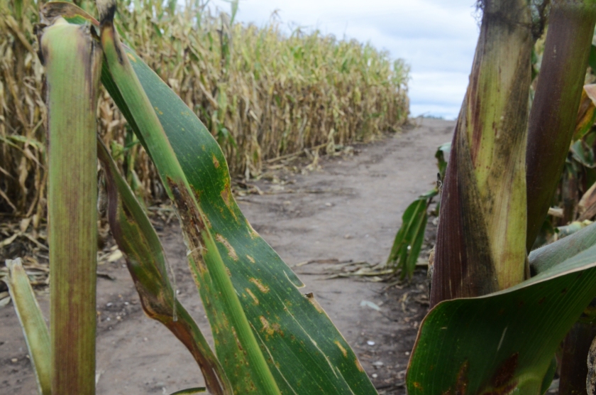
I was not proud of my work for the real person photo. I struggled with trying to figure out how to use the camera, thus my photos were underexposed. However, on the five photo assignment I did much better. I went to the Richardson’s Corn Maze and managed to take several strong photos and I also ended up getting 100% on the assignment. My pictures were much more vibrant and visually appealing. I think I also did better with capturing more elements in my photos instead of just capturing the subjects on the third. I really tried to find patterns and use objects to help frame the photos.

Overall, I am most proud of my NPR audio assignment. I went to the Annual Heritage Festival and at first I was nervous to talk to people. However, I stepped out of my comfort zone and just started talking to anyone that I could. I gathered great natural sounds that I knew would work well throughout the piece. I feel most confident about my audio gathering.

I feel more comfortable with interviewing than I ever have. Last year I wrote for MOVE Magazine through the Maneater and I struggled with feeling confident in my interviews. I feel much more comfortable coming up with questions.

Despite the workload, I enjoyed this class and I am happy to see that I have grown so much in such a short amount of time.

Blog Post 8: Responses

I choose to review Natalie’s and Lily’s. I think the photos in Lily’s photo story from the Columbia Tribune are strong, but they lack the ability to carry the story by themselves. It’s obvious that the pictures are taken at a winery, however it’s hard to find what the actual story is. I find that the photos in Natalie’s article, “In Amish Country, the Future is Calling”, work together and carry the piece by themselves. Natalie’s photo story focuses on showing how Amish people are incorporating modern technology into their lives under certain circumstances.

The first photo creates a sense of place. It shows a horse drawn buggy which establishes a sense of the amish community since they can’t use transportation such as a car.

The next photo transitions to showing how the amish people are dressed and it also creates a juxtaposition between a person’s typical idea of a festival. The caption reads that they are walking into a festival, however most people’s usual idea of a festival is filled with music, tons of people, food vendors, decorations and more. However, this “festival” again establishes a sense of place and shows what a festival looks like for the amish community.

The photographer transitions to the third photo with a portrait of an amish man using a cell phone. This portrait captures the curiosity and confusing on the man’s face as he stares down at his cell phone. The photographer uses the food at the farmer’s market as frames to focus is on the subject. I think this photo works well with the story because this is the first time that viewers see someone from a front view using technology.

In the seventh photo another amish man is working on the computer. This photo works well with the overall piece because again we see a man dressed in amish clothing, yet he is using a computer which is something that most people haven’t seen before.

Overall, I think the photos from the New York Times article work together better in order to tell a story. However, I think certain aspects of the photos from Lily’s article are done well, the pictures just don’t have the same ability to stand alone and carry the story.

The Richardson Corn Maze celebrates Cubs World Series win

The Richardson Adventure Farm designed a maze to celebrate one of Chicago’s most exciting accomplishments last fall: the Cubs winning the World Series.

farm
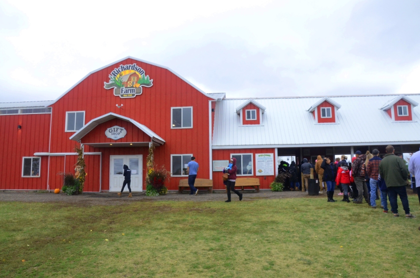
People wait in line before entering Richardson’s Adventure Farm. (Photo by Michelle Lumpkins)

The 544-acre-family-owned farm claims to create the world’s largest corn maze with the maze taking up nearly 30 acres.

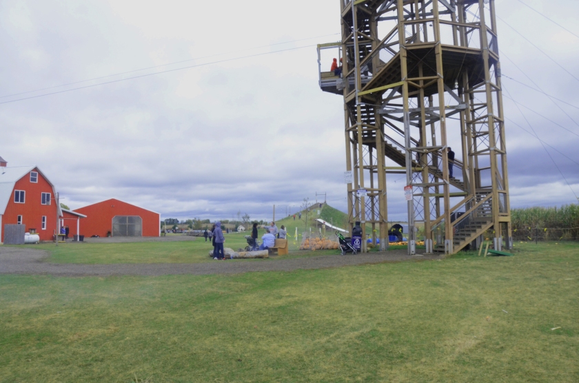
tower
Visitors walk up the tower to get an aerial view of the corn maze before entering. (Photo by Michelle Lumpkins)

After visitors walk into the farm they can climb the tower overlooking the maze. The maze features a Wrigley Field marquee announcing the team “World Champs”, the Chicago skyline, the Cubs logo, a Cubs pitcher and batter and more.

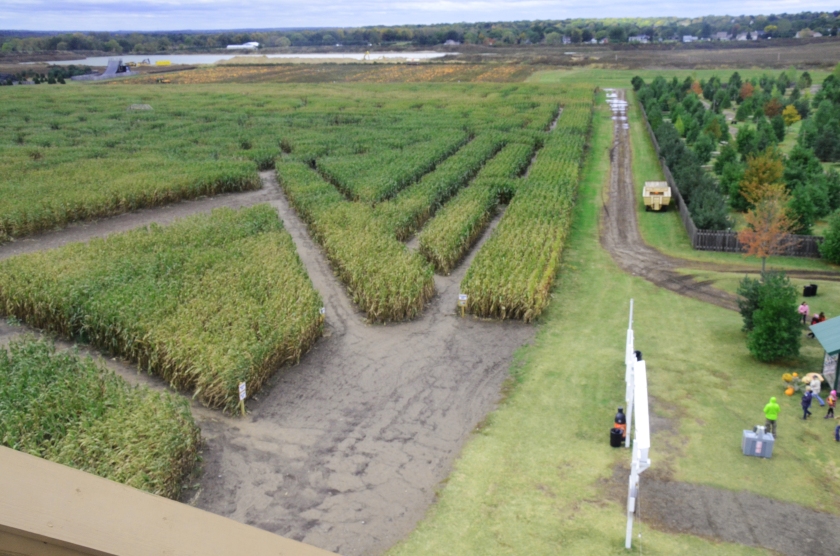
aerialview
An aerial view from the tower that shows the entrance of the corn maze. (Photo by Michelle Lumpkins)
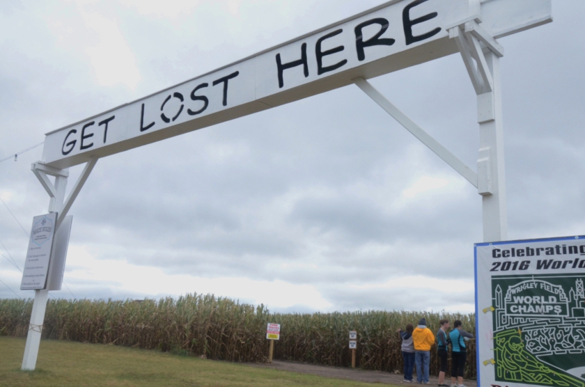
getlost
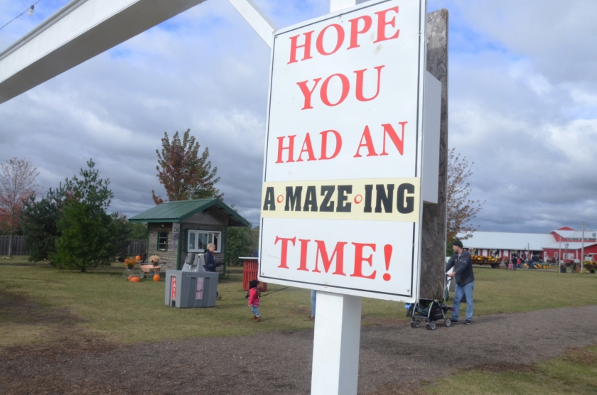
A sign reads, “get lost here” and introduces the entrance of the maze. (Photo by Michelle Lumpkins)

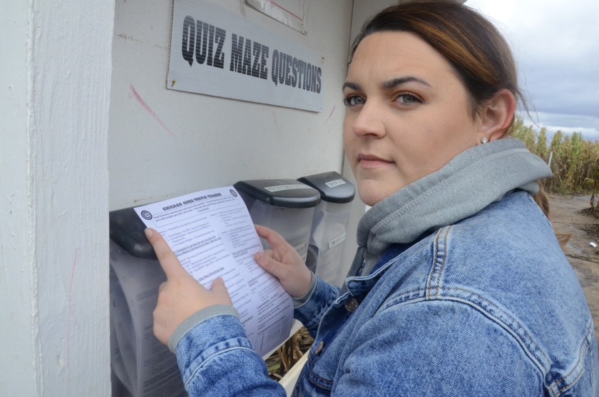
There are multiple entrances to begin the maze along with several exits. At the entrance there is a Quiz booth where people can grab a Chicago Cubs trivia quiz to use throughout the maze and stop at various checkpoints. If they reach all of them, they will receive a color poster of the maze.

Every year the the theme of the maze changes. Last year the maze celebrated the 50th anniversary of “Star Trek” and in 2015 the maze featured the Blackhawks Stanley Cup win.


marissa
Marissa Jezioro grabs a Chicago Cubs Trivia quiz before starting her journey through the maze. (Photo by Michelle Lumpkins)

Marissa Jezioro, a student at the University of Arizona, said she flew home to visit her family for the weekend and that she is happy she could stop by the maze with her friends this season.

“I’m a big Cubs fan, so I made sure that my friends would come with me to the corn maze this year while I was at home,” Jezioro said. “I came here when the theme was the Blackhawks winning the Stanley Cup so I wanted to be here for this one too.”

corn.jpg
A view of one of the exits from inside the maze. (Photo by Michelle Lumpkins)

The maze is open Wednesday through Friday during the months of September and October.

sign
A sign concludes the end of the maze. (Photo by Michelle Lumpkins)


Blog Post 7: Image Analysis

The Las Vegas shooting is the deadliest mass shooting in modern US history. I found this photo story interesting because it focuses on telling the story of the process of people attempting to return back to their daily lives after such a tragic event. Las Vegas is a popular tourists area and these pictures attempt to showcase life continuing to move forward and recovering.

The first photo ledes in by showing an eerie road, where two people are walking straight on what appears to be a crosswalk. Cars also appear in the background which illustrates a sense of direction and could be interpreted as society attempting to move past this strategy together. The photo is dimly lit with some light illuminating one of the people walking. It almost creates the idea that even in the darkest of times, people have to continue to find the light.

The photo then transitions to a shadow of a person against a patterned fence. I think that this transition is interesting because again we don’t see the full face of a person, instead we just see their shadow. I’m unsure as to why the photographer chose to transition to this particular photo, however I think it continues to carry the erie feeling from the first photo.

In the next photo it transitions to a sense of place. In the foreground it shows movement of people and their encounters. The Las Vegas Strip appears to be in the background which unifies the people because they are all walking together from the same place. On the side of the photo the glimmer of sun is visible which the photographer appears to be purposefully using in the photos. The sun shining on the side of the photo could have been cropped, however I think the photographer kept it to continue to provide that hope of always finding the light in the darkest of times.

From the previous photo it transitions to the next two photos where people are seen walking and sitting on the Las Vegas strip. I think this was a good transition from the previous photo and they both continue to incorporate lighting.

The photo focuses on a woman in the background gambling. At first, I thought this transition was abrupt. However, after taking a second look at the photograph you realize that the photographer is outside of the casino and is taking the picture from outside of the building. I think that this is a good transition from the previous photo that showed people sitting in a line outside a restaurant on the Las Vegas strip.

In the last photo a woman in the background is wearing a red dress and is walking toward a door while looking over her shoulder. The color red is a powerful and passionate color it could be interpreted as the color of love. I took this photo as a woman walking away from the cruel act that has taken place and looking over her shoulder as a reminder that this is something that the world will never forget, but the world also has to keep moving forward to ensure that acts of hate, the shooting, do not continue to happen.

Overall, I think for the most part this photo story works together to tell a compelling visual story of how people are trying to carry on with their lives after such a tragic event. The photographer does a great job of creating an eerie feeling and then transitioning to showing people trying to find light under the darkest of circumstances.

Link to photo story:

https://www.washingtonpost.com/news/in-sight/wp/2017/10/11/interpreting-tragedy-photographing-the-aftermath-of-the-las-vegas-shooting/?utm_term=.8475f46358db

Blog Post 6: Instructor Skills

http://www.cnn.com/interactive/2017/09/world/hurricane-maria-puerto-rico-cnnphotos/

https://www.washingtonpost.com/news/post-nation/wp/2017/09/20/hurricane-maria-takes-aim-at-puerto-rico-with-force-not-seen-in-modern-history/?utm_term=.93ed1aef240a

The devastation in Puerto Rico caused by the category 4 hurricane, Hurricane Maria, has been covered immensely in the news. The photographers from CNN and the Washington Post did a great job capturing the destruction and devastation to the lives of the people that call Puerto Rico their home.

One of the main strategies I recognized that the Washington Post utilized was patterns.

The first photo has patterns on the remaining side of what appears to be a house and there are also patterns on a fallen sign.

In the second photo the photographer uses patterns of the windows in the distance along with the tiles on the floor

I think the third photo does a good job at showing the damages from the hurricane, however I think they could have chosen a stronger photo to show the destruction from the hurricane. Again, patterns are seen in this photo, but other than that it isn’t that visually appealing.

Personally, I think that CNN did a better job capturing the damages of the hurricane and the effect on the people that live there. I really like the first photo because it does a great job of focusing on the background rather than the foreground. The blurred out solider doesn’t act as a distraction, but instead forces you to focus in on the background. In the background we see a woman helping move supplies off a truck.

The second photo presented does a decent job of capturing the subject on the third. However, the third photo is not visually appealing. The focus of the photo are gas cans and the caption describes the struggle to find gasoline. I think that the photographer should have taken a picture of people lined up waiting for gas or something else that would make it overall more effective and describe the situation better.

One of my favorite photos is the 15th picture which is a close shot of a woman praying before the hurricane. In the background there are other women praying. Overall, I think this is a powerful photo and was taken well.

Real Person Photo

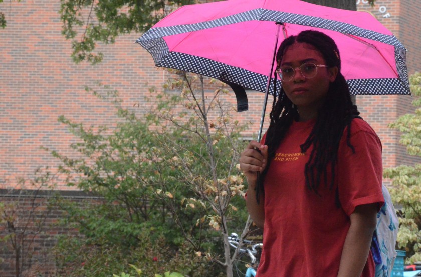
editj2Jameshia Sumlin walks past the columns on her way to her class at MU. (Photo by Michelle Lumpkins)

editmichael2

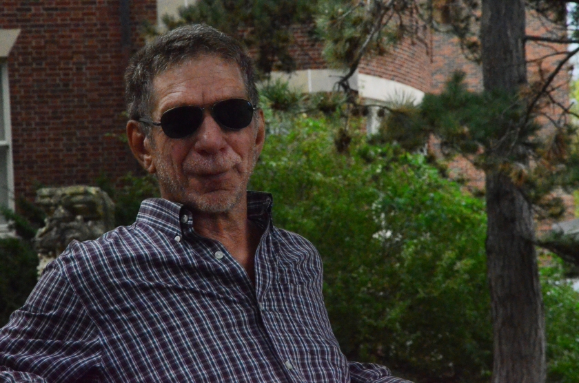
Michael Bohms enjoys sitting in his favorite spot on MU campus in downtown, Columbia. He said he has always loved reading by the Journalism School. (Photo by Michelle Lumpkins)

editnatalie22

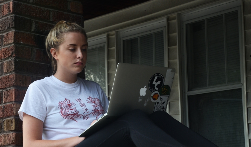
Natalie Marvin studies on her porch on East Campus, Columbia. She said the fresh air helped her relieve stress and focus. (Photo by Michelle Lumpkins)


Blog Post 5: Responses

RE: Claire Nichols

Claire chose a video from KOMU that covered the Jefferson City Boys and Girls Club receiving tracking activity wristbands in attempt to reduce obesity rates. Overall, I think that the video included reliable sources. I think it was effective to include an interview with a B&GC member. I think that adding more interviews from B&GC members would make it more effective. I don’t think there is any obvious bias coming from any of the interviews. However, one could argue that there are some underlying bias from Ravi Johar, MD, Chief Medical Officer. Of course he is going to support the activity tracking wristbands from a health perspective. There could also be some bias coming from Gillian Hardin, the B&GC member. She says that she thinks it is cool but she might just be saying that because she is in front of a camera. Overall, I think Claire did a great job analyzing this source.


RE: Mikala Blum

Mikala analyzed a video featured on Good Morning America that discusses the National Football League controversy. There a variety of sources provided ranging from African-American athletes, sports fans, an ESPN newscaster and more. I think what makes this video effective is the wide range of different opinions throughout the piece. Listeners hear from people that disagree with what the players did and then we hear from the players themselves. One apparent bias is that all the sports fans that were interviewed were white and all of them said the players should stand. I think it would have been more effective to add other interviews with people from different backgrounds and how they felt about the controversy. Another bias is that the players are African-American so they might have a bias toward the presidency and how they feel about the stance they are taking. I think that Mikala did a good job analyzing each of the sources.